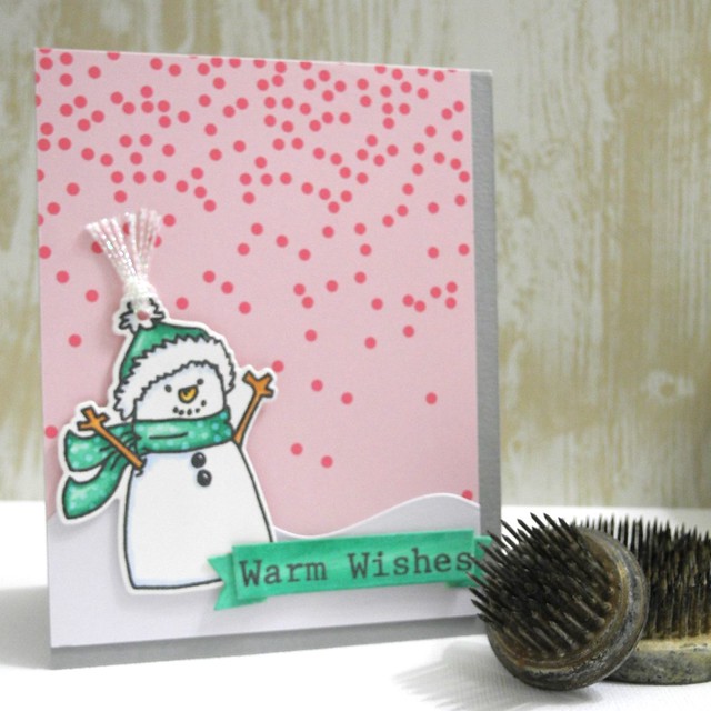
It's not really all that cold around here yet. Mornings have generally been in the 50's...sometimes just under, and the days are still in the 60's, sometimes over! BUT, this snowman was too cute to wait for frigid temps! I just love him!

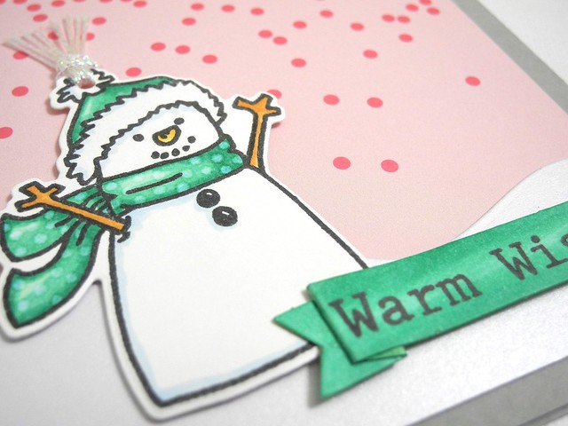
Oh, for the LOVE of all things adorable! I used the Avery Elle Be Jolly stamp set along with the coordinating Avery Elle die to create my own tag! I just added a hole to the hat and pulled some shiny May Arts string through it for a super cute look! The patterned paper is from the Avery Elle The Everyday Collection 6x6 paper pad, with which I am currently having a very hot love affair. For reals, though. It's steamy.

The snowy hill is Crafter's Companion Shimmering Cardstock (GO! GET SOME! NOWISH!) in pearl. It is SOOO pretty in real life! I cut the hill using the Avery Elle Custom Panels die set. This is SUCH a useful set of dies. I can't say that enough! The image and the banner are colored with Spectrum Noir pens. I wanted my banner to be a perfect match, so I just colored white cardstock to get the right look! Love that! I used my blender pen to remove color from the scarf to create the polka dots. I REALLY love polka dots!
I was inspired to create this card by the Avery Elle TAGS challenge! So fun!
Also... before you go, I do have a question...I have been torn on my photos as of late. Do you guys prefer the straight on, no props photos or these slightly angled with minimal props shots like the one above? I just can't decide which I like better! I'd love to know your thoughts and which you are more likely to PIN! :) Thanks for your thoughts! You guys super rock!
Have a Happy!

Oh, for the LOVE of all things adorable! I used the Avery Elle Be Jolly stamp set along with the coordinating Avery Elle die to create my own tag! I just added a hole to the hat and pulled some shiny May Arts string through it for a super cute look! The patterned paper is from the Avery Elle The Everyday Collection 6x6 paper pad, with which I am currently having a very hot love affair. For reals, though. It's steamy.

The snowy hill is Crafter's Companion Shimmering Cardstock (GO! GET SOME! NOWISH!) in pearl. It is SOOO pretty in real life! I cut the hill using the Avery Elle Custom Panels die set. This is SUCH a useful set of dies. I can't say that enough! The image and the banner are colored with Spectrum Noir pens. I wanted my banner to be a perfect match, so I just colored white cardstock to get the right look! Love that! I used my blender pen to remove color from the scarf to create the polka dots. I REALLY love polka dots!
I was inspired to create this card by the Avery Elle TAGS challenge! So fun!
Also... before you go, I do have a question...I have been torn on my photos as of late. Do you guys prefer the straight on, no props photos or these slightly angled with minimal props shots like the one above? I just can't decide which I like better! I'd love to know your thoughts and which you are more likely to PIN! :) Thanks for your thoughts! You guys super rock!
Have a Happy!


I was thinking I'd say the angled with props, but then I went back through your last few blog posts and I think I actually like the straight-on shots better! You can't really go wrong either way though - the cards look great!
ReplyDeleteCUTE! Love the pink background. On the pics....I like 'em both...but I prefer the no props versions.
ReplyDeleteSuper cute card!!! Love! And all your photos are great! Though, I tend to like photos with no props and angled. ;)
ReplyDeleteSo cute! Love the tassles on his hat!
ReplyDeletehow cute is that snowman.. love this card.
ReplyDeleteSuch an adorable card!! Love that snowman and the colors! So lovely!! Side note - I want that weather! It's still hot and humid here (south Carolina)!
ReplyDeleteOh my, this card is just too stinkin' cute! LOVE that little snowman! He makes the perfect tag :)
ReplyDeleteSo cute :) I like the pink and mint !
ReplyDeleteNo props, so your card can shine on its own. That being said, I don't dislike the props, so go with what you prefer!!
ReplyDeleteThats a tricky question because I tend to PIN a card because I really like it, not because of the photo (although if it was a really sucky, blurry photo that would probably put me off a bit....). I like an angled shot best I think...and sometimes it does look nice with a few bits and bobs around. Maybe just see how the card makes you feel each time and go from there. Love this card by the way, the pink with the snowman is gorgeous!!!
ReplyDeleteLove the cute cute cute snowman! :) I pin a card if I love it regardless of props but that being said I noticed most stuff I pin is a straight on, clear shot, no fuss!
ReplyDeleteSuper cute card!!! As far as the photos, I like the ones without the props.
ReplyDeleteI always love seeing your cards but the plain ones without props are my favorite so I am not distracted from the design.
ReplyDeleteToo stinkin' cuuuuute!!! Love the sweet color combo, too!
ReplyDeleteI really don't need props along with the picture of the card. The card is the main feature and should be shown that way. I do like pictures from different angles.
ReplyDeleteSometimes you wonder if a feature was popped but you can't tell because the photo is too straight out.
Hi, love the cute snowman. I think it's nice to have at least one clear photo of the card straight on. After all that's what you are showing. Angled shots and close up's to see details are also great. I would put the props behind so your art is the focus. You do such good clear well lit photo's. Do you use a light box??
ReplyDeleteHow stinky cute is the snowman!! I love the sweet colors and that little cute pom-pom! Congrats on your AE challenge win!
ReplyDelete